Containers
Containers are the most basic layout element in Bootstrap and are required when using our default grid system. Containers are used to contain, pad, and (sometimes) center the content within them.
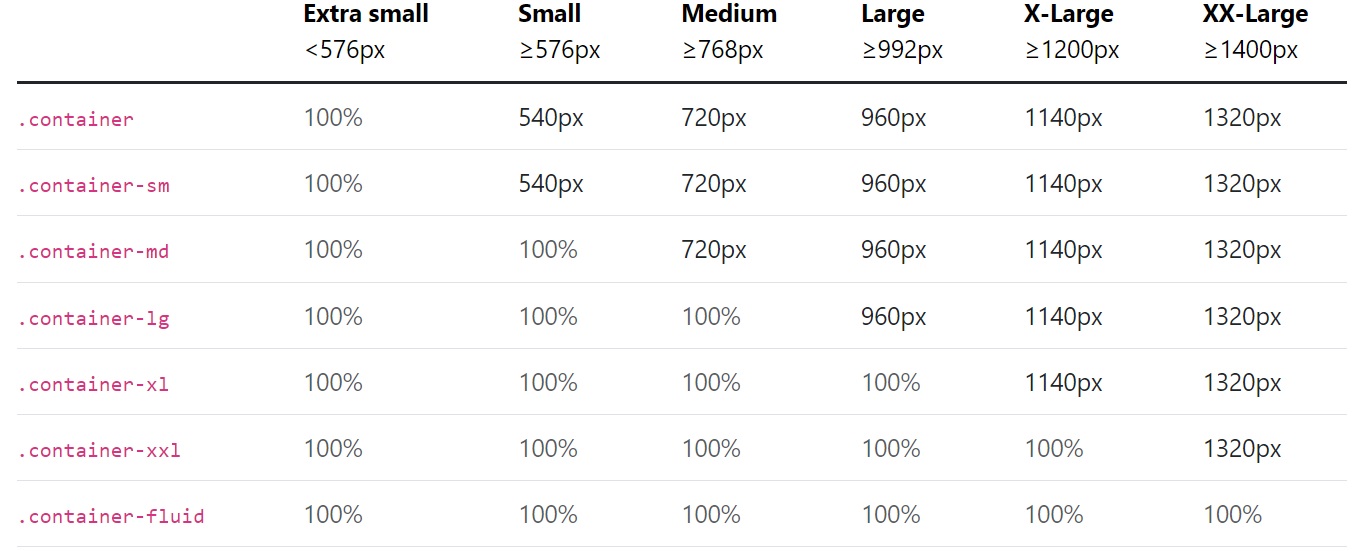
The table below illustrates how each container’s max-width compares to the original .container and .container-fluid across each breakpoint.
Fixed Containers Try It
Default .container class is a responsive, fixed-width container, meaning its max-width changes at each breakpoint.
<div class="container">
  <!-- Content here -->
</div>
Fluid Containers Try It
We can use the .container-fluid class to create a full width container. The width of the fluid container will always be 100% irrespective of the devices or screen sizes.
<div class="container-fluid">
  <!-- Content here -->
</div>
Responsive containers Try It
Responsive containers allow you to specify a class that is 100% wide until the specified breakpoint is reached, after which we apply max-widths for each of the higher breakpoints. For example, .container-sm is 100% wide to start until the sm breakpoint is reached, where it will scale up with md, lg, xl, and xxl.
<div class="container-sm">100% wide until small breakpoint</div>
<div class="container-md">100% wide until medium breakpoint</div>
<div class="container-lg">100% wide until large breakpoint</div>
<div class="container-xl">100% wide until extra large breakpoint</div>
<div class="container-xxl">100% wide until extra extra large breakpoint</div>
Adding Background and Borders to Containers Try It
By default, container doesn't have any background-color or border. But if you need you can apply your own styles, or simply use the Bootstrap background-color and border utility classes to add background-color or border on them
<div class="container bg-dark text-white boarder">
    <h1>This is a heading</h1>
    <p>This is a paragraph of text.</p>
</div>
Applying Paddings and Margins to Containers Try It
By default, containers have padding of 12px on the left and right sides, and no padding on the top and bottom sides. To apply extra padding and margins you can use the spacing utility classes.
<div class="container border py-3 my-3">
    <h1>This is a heading</h1>
    <p>This is a paragraph of text.</p>
</div>