Bootstrap’s grid system
Bootstrap’s grid system uses a series of containers, rows, and columns to layout and align content. It’s built with flexbox and is fully responsive. The Bootstrap grid system can have up to 12 columns, and you can specify how these columns scale for different viewport sizes.
Example to create three equal-width columns: Try It
The following example to creates three equal-width columns across all devices and viewports using predefined grid classes. These columns are centered in the page with the parent .container.
<div class="container">
  <div class="row">
    <div class="col">
      Column
    </div>
    <div class="col">
      Column
    </div>
    <div class="col">
      Column
    </div>
  </div>
</div>
Responsive Columns: Try It
The following example shows how to create three equal-width columns starting at tablets and scaling to extra large desktops. On mobile phones or screens that are less than 576px wide, the columns will automatically stack on top of each other:
<div class="row">
  <div class="col-sm-3">.col-sm-3</div>
  <div class="col-sm-3">.col-sm-3</div>
  <div class="col-sm-3">.col-sm-3</div>
</div>
Two Unequal Responsive Columns: Try It
The following example shows how to get two various-width columns starting at tablets and scaling to large extra desktops:
<div class="row">
  <div class="col-sm-4">.col-sm-4</div>
  <div class="col-sm-8">.col-sm-8</div>
</div>
Three Unequal Responsive Columns: Try It
The following example shows how to get three various-width columns starting at tablets and scaling to large extra desktops:
<div class="row">
  <div class="col-sm-2">.col-sm-2</div>
  <div class="col-sm-8">.col-sm-8</div>
  <div class="col-sm-2">.col-sm-2</div>
</div>
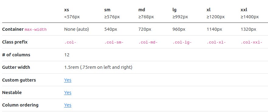
Grid options
Bootstrap’s grid system can adapt across all six default breakpoints, and any breakpoints you customize. The six default grid tiers are as follow:
- Extra small (xs)
- Small (sm)
- Medium (md)
- Large (lg)
- Extra large (xl)
- Extra extra large (xxl)
As noted above, each of these breakpoints have their own container, unique class prefix, and modifiers. Here’s how the grid changes across these breakpoints: